
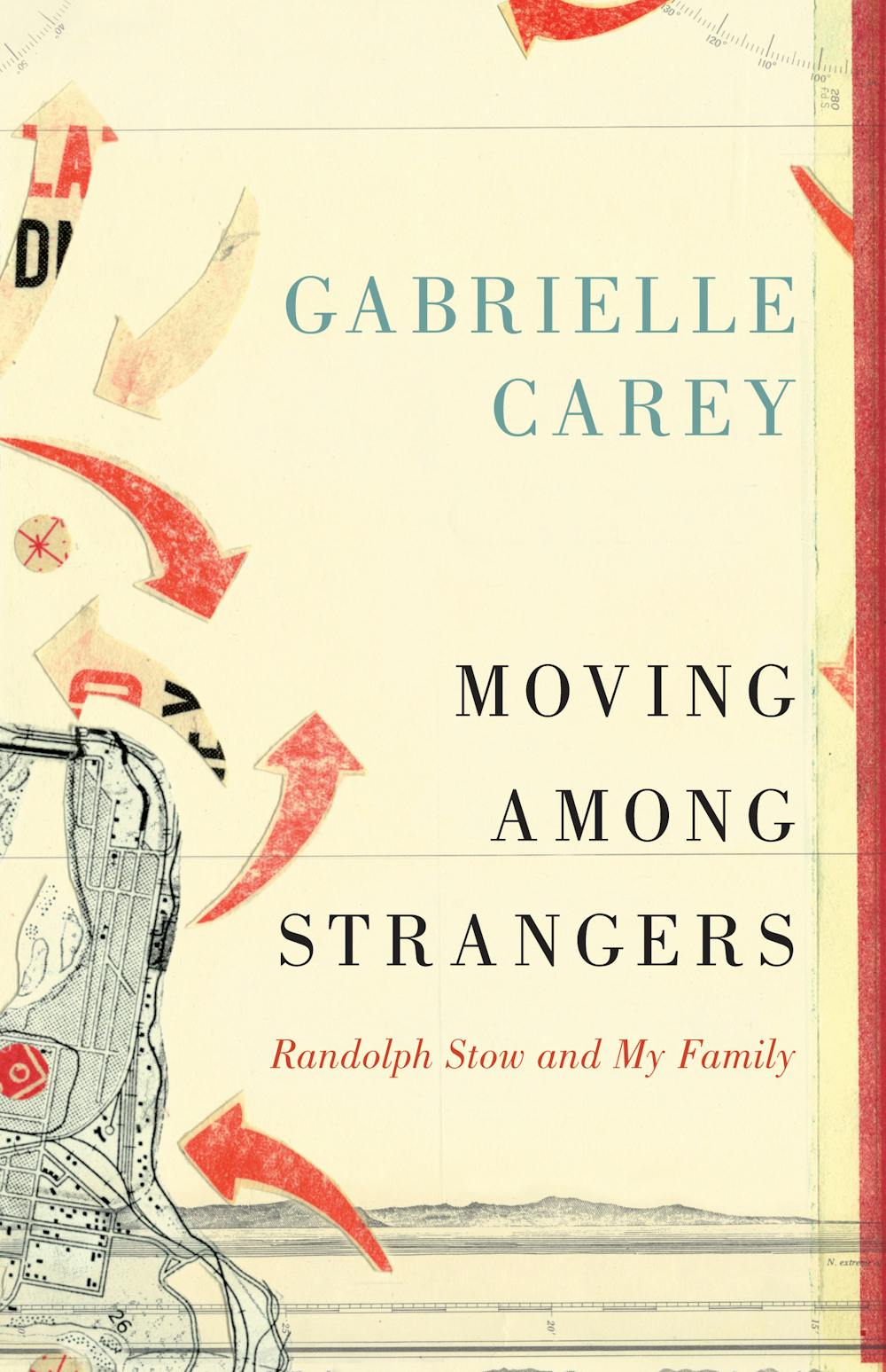
Last year, while designing the cover for Gabrielle Carey’s book Moving Among Strangers (UQP, 2013), Gabrielle and I started talking about book trailers.
A book trailer is a short video created to promote a book, similar to a trailer promoting a film. But where a film trailer is created by editing together snippets of the feature length film, a printed book has no existing audio-visual material to draw from.
So why promote a book with a video?
The obvious answer is that, as people increasingly buy books online, publishers must appeal to consumers online. This means thinking past static book covers and short blurbs, to more enhanced media.
Gabrielle’s book via QUP’s website looks like this:

And via Amazon.com:
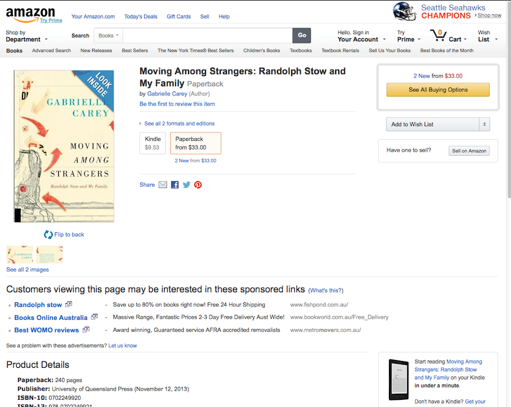
Both QUP and Amazon’s websites have more textual information than is feasible to fit on a book cover: a long collection of quotes from (and links to) reviews of the book, and to Gabrielle’s other books and extended biography. This additional information gives readers more to base their purchase decision on, particularly the reassurance that other people considered it a good read.
Both sites are also loud with ads and other unrelated information. What’s lost online is the ability to make a connection with the book – hold the thing, to flip through and get an idea of the writing style and story – to push the consumer from browsing to buying.
Amazon.com attempts to rectify this with its “LOOK INSIDE!” function:
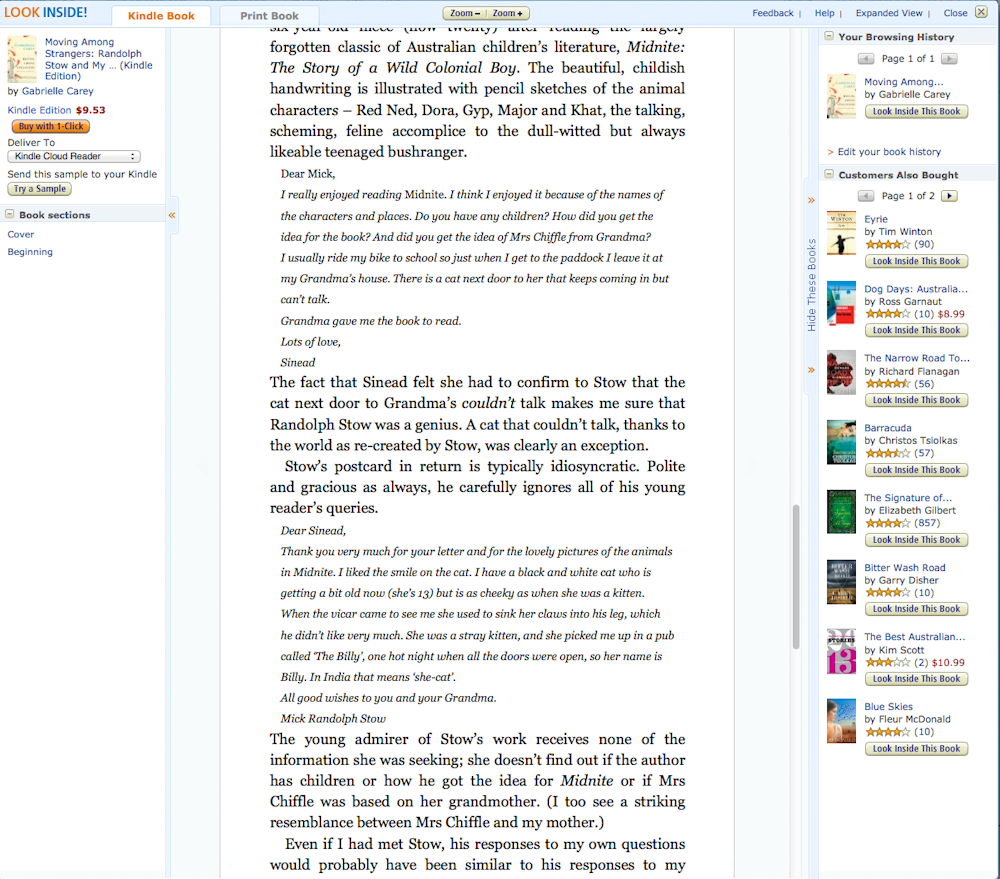
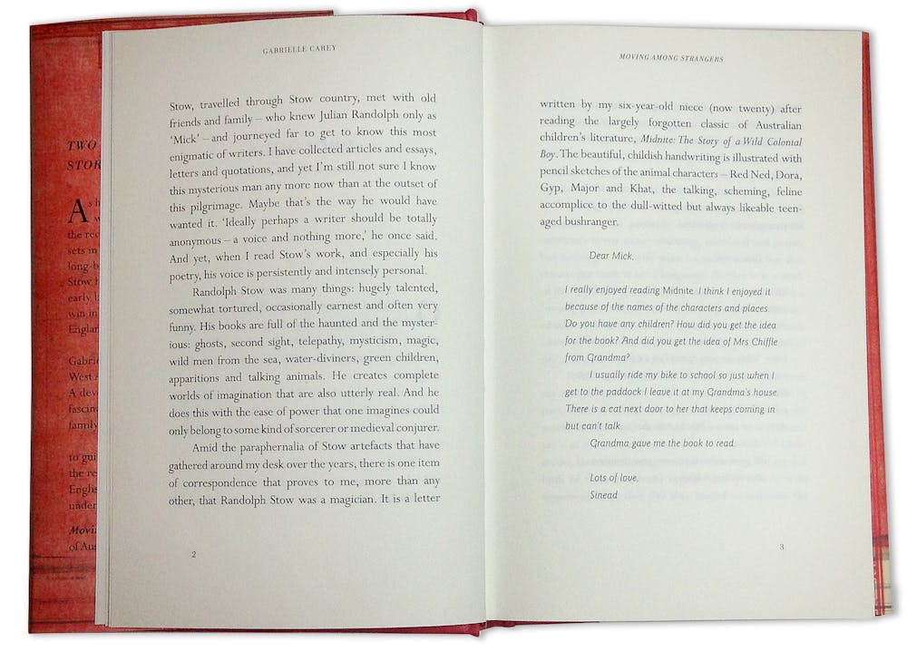
Although this provides a taste of the writing style, it doesn’t give a sense of the book object. The typesetting of the actual book is significantly more appealing than this digital preview suggests (if I do say so myself), which may be neither here nor there to many people, but some of us make choices at least partially based on the aesthetic appeal of a book.
I’m particularly sensitive to this is because Amazon has lied to me before. The copy I ordered of Sven Birket’s The Gutenberg Elegies: The Fate of Reading in an Electronic Age appeared to be printed using a fax machine – the text was so blobby I could barely read it. To be fair, the Amazon preview appears blobby, but I assumed it was a low-resolution scan. I didn’t believe anyone would sell a book that poorly printed. If I’d seen it in a bookshop I wouldn’t have bought it. Apologies to my local independent bookshops – lesson learned.
But this is an extreme case. On its own, unappealing typesetting may not be enough to turn people (other than me) off buying a book. Yet without creating a physical and aesthetic connection to a book via the design there is one less element to tip consumers over the line from browsing to buying. And in the current publishing market where every book sale matters, this is significant.
The value of a book trailer, then, is the potential to add an evocative element to a book’s on-line presence, which is lost when the cover, paper stock and typesetting are removed from the book package. But trying to directly replicate this tactile experience on screen doesn’t work:
If you can’t translate the experience of browsing a book effectively on screen, what can you do? To think this through, Gabrielle and I decided to make a trailer for her book.
We commissioned one of my students Kallie Ennever to create the trailer for us. I handed over a digital folder with my drafts, layered Photoshop files and raw collage elements for her to work from (the bits I used to make the cover illustration). It made sense that the trailer should match the look of the cover, to reinforce the visual identity of the book. Gabrielle wrote the script.
Kallie showed me an animatic – an animated storyboard for how the final will look – and we discussed pacing and narrative. Otherwise, the motion graphic sequence is all her own creative work.
Gabrielle used her network to pull together some impressive audio elements. We recorded Gabrielle reading a short passage from the book. Geordie Williamson, chief literary critic of The Australian newspaper, recorded himself reading a passage of Stow’s prose for us (the book is about the connection between Australian author Randolph Stow and Gabrielle’s family). Composer Iain Grandage, who wrote the score for an adaptation of Stow’s book The Merry-go-Round in The Sea produced by Perth’s Black Swan State Theatre Company in 2002, gave us permission to use another of his Australian inspired compositions as a soundtrack.
Kallie was paid by Gabrielle for her time – we do not endorse students working for free. Otherwise, no-one was paid for their time or contribution in making of the trailer. With less resources and generosity, I’m not sure how authors without the financial backing of a willing publisher would deal with the production costs of producing even a short trailer.